When UIMenu Isn’t Enough: Building a Custom Context Menu in UIKit
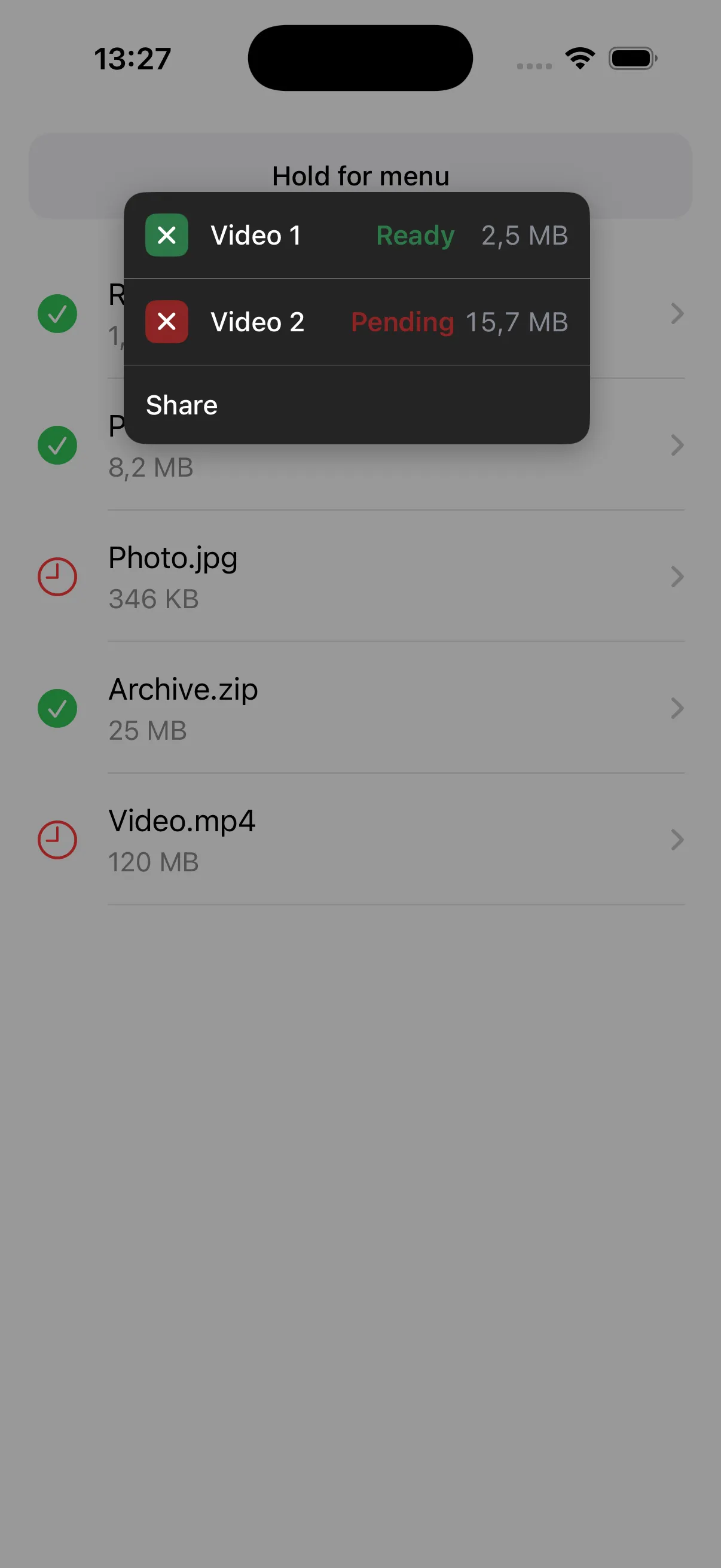
Seven context menus across the app. All UIMenu. All fine — until a data list screen needed per-row status: colored badges, state text, right-aligned metadata. Each row could be ready, pending, or expired, and the menu had to reflect that at a glance.
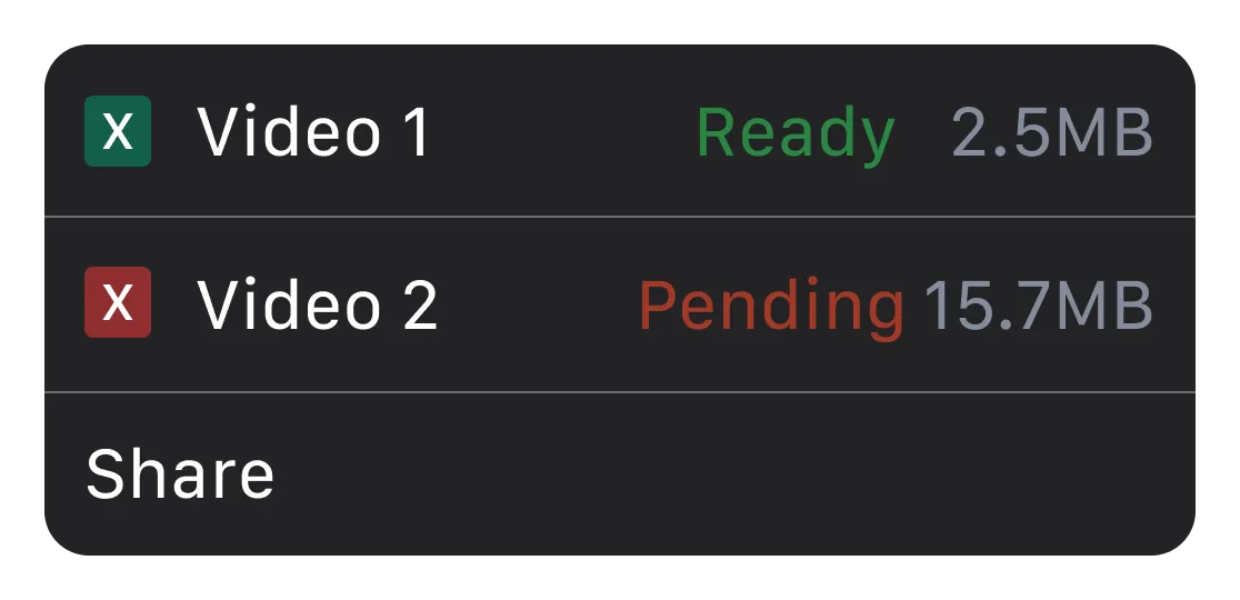
A colored status badge on the left. Colored status text in the middle. A right-aligned metadata column. Three things UIAction simply cannot express.
First attempt: SF Symbol tinting on the image property. The tint colored the entire symbol — you can’t target just the badge fill. Second: attributed strings on UIAction.title. UIKit flattens them to plain text. No color, no font variation, no layout control. The core problem is that UIAction’s layout model is fundamentally single-column — there’s no way to compose multiple independently styled elements inside a single row.
So I built my own — under one requirement: it had to feel native. Same long-press, same haptic, same dimming. Users shouldn’t know the difference. Three files, one job each, and the whole thing piggybacks on UIContextMenuInteraction for gesture recognition and haptics.
Let’s get into it.
Why UIMenu falls short
To be clear — UIMenu is the right answer 95% of the time. It’s fast, accessible, and consistent with the platform. But here’s what it cannot do:
- Color individual text segments within a single action row (e.g., green “Ready” next to white “Download Report”)
- Add colored status badges per item with custom background colors
- Add an aligned metadata column (file size, timestamp, count) on the right side of each row
- Suppress the cell preview/snapshot that UIKit generates during the long-press lift
Let’s build them in order.
Start with the models
import UIKit

// MARK: - Width Mode

enum ContextMenuWidthMode {
    case auto(minWidth: CGFloat = 260)
    case fixed(CGFloat)

    var defaultWidth: CGFloat {
        switch self {
        case .auto: return 0
        case .fixed(let width): return width
        }
    }
}

// MARK: - Badge

enum ContextMenuBadge {
    case ready
    case pending

    var color: UIColor {
        switch self {
        case .ready:   return UIColor(red: 0.17, green: 0.47, blue: 0.28, alpha: 1.0)
        case .pending: return UIColor(red: 0.55, green: 0.14, blue: 0.14, alpha: 1.0)
        }
    }
}

// MARK: - Menu Item

/// A single row in the custom context menu.
///
/// **Layout** (left to right):
/// ```
/// [ badge | title | spacer | statusText | detail ]
/// ```
struct ContextMenuItem {
    let id = UUID()
    let badge: ContextMenuBadge?
    let title: String
    let statusText: String?
    let statusColor: UIColor?
    let detail: String?
    let detailColor: UIColor
    let action: () -> Void

    init(
        badge: ContextMenuBadge? = nil,
        title: String,
        statusText: String? = nil,
        statusColor: UIColor? = nil,
        detail: String? = nil,
        detailColor: UIColor = .secondaryLabel,
        action: @escaping () -> Void
    ) {
        self.badge = badge
        self.title = title
        self.statusText = statusText
        self.statusColor = statusColor
        self.detail = detail
        self.detailColor = detailColor
        self.action = action
    }
}

// MARK: - Configuration

/// All the information needed to present a custom context menu.
struct ContextMenuConfiguration {
    let items: [ContextMenuItem]
    let sourceRect: CGRect
    let sourceView: UIView
    let widthMode: ContextMenuWidthMode

    init(
        items: [ContextMenuItem],
        sourceRect: CGRect,
        sourceView: UIView,
        widthMode: ContextMenuWidthMode = .fixed(260)
    ) {
        self.items = items
        self.sourceRect = sourceRect
        self.sourceView = sourceView
        self.widthMode = widthMode
    }
}A few non-obvious choices here. The action: () -> Void closure lives directly on the model — this keeps the configuration site clean because the caller builds both the data and the behavior in one place, rather than wiring up a delegate or target-action later. It also means the ContextMenuItem struct is the only contract someone on the team needs to understand — add a new menu item without ever opening the view controller file. And because the action closure is the only side effect, you can test your configuration builder in isolation: assert that the right items appear for the right data state without presenting any UI.
The ContextMenuWidthMode enum exists because .auto needs to measure text at runtime (more on that in the VC section), while .fixed avoids that cost when you already know the layout.
Hijacking UIContextMenuInteraction
This is the core trick — and the most interesting part of the whole architecture.
The idea: attach a real UIContextMenuInteraction to your view so you get the native long-press gesture recognizer and haptic feedback for free. Then return nil from the delegate method to suppress UIKit’s own menu, and present your custom one instead.
flowchart LR
  A["Long press detected"] --> B["Delegate fires"]
  B --> C["Return nil
(suppress native menu)"]
  C --> D["DispatchQueue.main.async"]
  D --> E["presentMenu()"]
  E --> F["Custom VC appears"]
The nice part is that UIKit handles gesture recognition and haptics, while we take over the presentation.
import UIKit

final class CustomContextMenu: NSObject, UIContextMenuInteractionDelegate {

    // MARK: - Properties

    private weak var targetView: UIView?
    private var configurationProvider: ((CGPoint) -> ContextMenuConfiguration?)?
    private var interaction: UIContextMenuInteraction?

    deinit {
        detach()
    }

    // MARK: - Public API

    func attach(
        to view: UIView,
        configurationProvider: @escaping (CGPoint) -> ContextMenuConfiguration?
    ) {
        self.targetView = view
        self.configurationProvider = configurationProvider

        let interaction = UIContextMenuInteraction(delegate: self)
        view.addInteraction(interaction)
        self.interaction = interaction
    }

    func detach() {
        if let interaction, let view = targetView {
            view.removeInteraction(interaction)
        }
        interaction = nil
        targetView = nil
        configurationProvider = nil
    }

    // MARK: - Presentation

    func presentMenu(at location: CGPoint) {
        UIImpactFeedbackGenerator(style: .light).impactOccurred()

        guard let targetView,
              let viewController = targetView.window?.rootViewController,
              let config = configurationProvider?(location) else { return }

        let menuVC = CustomContextMenuViewController(configuration: config)
        viewController.present(menuVC, animated: true)
    }

    // MARK: - UIContextMenuInteractionDelegate

    func contextMenuInteraction(
        _ interaction: UIContextMenuInteraction,
        configurationForMenuAtLocation location: CGPoint
    ) -> UIContextMenuConfiguration? {
        DispatchQueue.main.async { [weak self] in
            self?.presentMenu(at: location)
        }
        return nil
    }
}The DispatchQueue.main.async is not optional. When the delegate method fires, UIKit is mid-gesture — it’s still deciding whether to show a preview, animate the lift, or begin a drag. If you call present(_:animated:) synchronously inside configurationForMenuAtLocation, you’ll get layout conflicts and occasional blank frames. Dispatching to the next run-loop tick lets UIKit finish its own housekeeping first. Then you present on a clean slate.
The menu view controller
The full view controller is ~340 lines, mostly layout and presentation setup. init sets .overFullScreen (so the presenting VC’s view stays visible behind a 40% black scrim) and .crossDissolve (a subtle fade, not a sheet slide). setupView() adds the dimming background, a rounded container with shadow, and a tap gesture for dismissal — handleBackgroundTap hit-tests against containerView.frame, so tapping inside the menu doesn’t accidentally close it. setupMenuItems() loops through items, inserting separators between them. And handleItemTap dismisses first, then fires the action in the completion block — this matters if the action presents another modal, because UIKit won’t let you present on top of a VC that’s mid-dismissal.
The two pieces worth reading inline are the item builder and the positioning logic. For the complete implementation, see the sample project on GitHub.
Building menu items
The row layout is a flat UIStackView — badge, title, spacer, status, detail. No nesting, which keeps Auto Layout from fighting over priorities when optional elements are absent. Before building the rows, setupMenuItems() pre-calculates maxDetailWidth — the widest detail string measured with the monospaced digit font — so every row’s detail label gets the same fixed-width constraint, keeping the column aligned.
private func createMenuItemView(for item: ContextMenuItem, maxDetailWidth: CGFloat) -> UIView {
    let itemView = UIView()
    itemView.translatesAutoresizingMaskIntoConstraints = false

    let tapGesture = UITapGestureRecognizer(
        target: self, action: #selector(handleItemTap(_:))
    )
    itemView.addGestureRecognizer(tapGesture)
    itemView.tag = configuration.items.firstIndex(where: { $0.id == item.id }) ?? 0

    itemView.isAccessibilityElement = true
    itemView.accessibilityTraits = .button
    itemView.accessibilityLabel = [item.title, item.statusText, item.detail]
        .compactMap { $0 }
        .joined(separator: ", ")

    let hStack = UIStackView()
    hStack.axis = .horizontal
    hStack.spacing = 12
    hStack.alignment = .center
    hStack.translatesAutoresizingMaskIntoConstraints = false

    // Badge (optional) — colored container with xmark icon
    if let badge = item.badge {
        let badgeContainer = UIView()
        badgeContainer.backgroundColor = badge.color
        badgeContainer.layer.cornerRadius = 6
        badgeContainer.clipsToBounds = true
        badgeContainer.translatesAutoresizingMaskIntoConstraints = false

        let xmarkConfig = UIImage.SymbolConfiguration(pointSize: 12, weight: .bold)
        let xmarkImageView = UIImageView(image: UIImage(systemName: "xmark", withConfiguration: xmarkConfig))
        xmarkImageView.tintColor = .white
        xmarkImageView.contentMode = .scaleAspectFit
        xmarkImageView.translatesAutoresizingMaskIntoConstraints = false

        badgeContainer.addSubview(xmarkImageView)
        NSLayoutConstraint.activate([
            badgeContainer.widthAnchor.constraint(equalToConstant: 24),
            badgeContainer.heightAnchor.constraint(equalToConstant: 24),
            xmarkImageView.centerXAnchor.constraint(equalTo: badgeContainer.centerXAnchor),
            xmarkImageView.centerYAnchor.constraint(equalTo: badgeContainer.centerYAnchor)
        ])
        hStack.addArrangedSubview(badgeContainer)
    }

    // Content stack
    let contentStack = UIStackView()
    contentStack.axis = .horizontal
    contentStack.spacing = 4
    contentStack.alignment = .center

    let titleLabel = UILabel()
    titleLabel.text = item.title
    titleLabel.textColor = .white
    titleLabel.font = .systemFont(ofSize: 15, weight: .medium)
    titleLabel.lineBreakMode = .byTruncatingTail
    titleLabel.setContentHuggingPriority(.defaultLow, for: .horizontal)
    titleLabel.setContentCompressionResistancePriority(.defaultLow, for: .horizontal)
    contentStack.addArrangedSubview(titleLabel)

    let spacer = UIView()
    spacer.setContentHuggingPriority(.defaultLow, for: .horizontal)
    contentStack.addArrangedSubview(spacer)

    // Status text (colored)
    if let statusText = item.statusText, let statusColor = item.statusColor {
        let statusLabel = UILabel()
        statusLabel.text = statusText
        statusLabel.textColor = statusColor
        statusLabel.font = .systemFont(ofSize: 15, weight: .semibold)
        statusLabel.setContentHuggingPriority(.required, for: .horizontal)
        contentStack.addArrangedSubview(statusLabel)
    }

    // Detail (e.g., file size) — fixed-width for column alignment
    if let detail = item.detail {
        let detailLabel = UILabel()
        detailLabel.text = detail
        detailLabel.textColor = item.detailColor
        detailLabel.font = .monospacedDigitSystemFont(ofSize: 15, weight: .regular)
        detailLabel.textAlignment = .right
        detailLabel.setContentHuggingPriority(.required, for: .horizontal)
        detailLabel.translatesAutoresizingMaskIntoConstraints = false
        detailLabel.widthAnchor.constraint(equalToConstant: maxDetailWidth).isActive = true
        contentStack.addArrangedSubview(detailLabel)
    }

    hStack.addArrangedSubview(contentStack)
    itemView.addSubview(hStack)

    NSLayoutConstraint.activate([
        hStack.topAnchor.constraint(equalTo: itemView.topAnchor, constant: 12),
        hStack.leadingAnchor.constraint(equalTo: itemView.leadingAnchor, constant: 12),
        hStack.trailingAnchor.constraint(equalTo: itemView.trailingAnchor, constant: -12),
        hStack.bottomAnchor.constraint(equalTo: itemView.bottomAnchor, constant: -12),
        itemView.heightAnchor.constraint(greaterThanOrEqualToConstant: 44)
    ])

    return itemView
}Monospaced digit fonts keep the detail column aligned as values change — “2.4” and “12.8” occupy the same width. The detail label uses a fixed-width constraint (maxDetailWidth) so that values of different lengths still right-align into a clean column. Status and detail labels hug at .required so the title truncates first, which is correct behavior for variable-width content. Each row also sets isAccessibilityElement = true with a compound accessibilityLabel built from title, status, and detail — so VoiceOver reads the full context in one pass rather than stepping through individual labels.
Smart positioning through the window coordinate system
The menu is presented as .overFullScreen, which means it has its own coordinate space. Meanwhile, the source rect comes from a view that might be deep inside a UITableView hierarchy. You can’t just use the source rect directly — the coordinates won’t match.
The fix is a two-step conversion through the window (the common ancestor of both coordinate spaces):
private func positionMenu() {
    view.layoutIfNeeded()

    guard let window = view.window ?? configuration.sourceView.window else { return }

    // Step 1: source view → window coordinates
    let rectInWindow = configuration.sourceView.convert(
        configuration.sourceRect, to: window
    )
    // Step 2: window → modal view coordinates
    let sourceRect = view.convert(rectInWindow, from: window)

    let menuWidth: CGFloat
    switch configuration.widthMode {
    case .auto:
        menuWidth = calculateAutoWidth()
    case .fixed(let width):
        menuWidth = width
    }

    let menuHeight = containerView.systemLayoutSizeFitting(
        CGSize(width: menuWidth, height: UIView.layoutFittingCompressedSize.height),
        withHorizontalFittingPriority: .required,
        verticalFittingPriority: .fittingSizeLevel
    ).height

    // Center horizontally on the source, position below it
    var x = sourceRect.midX - menuWidth / 2
    var y = sourceRect.maxY + 8

    // Clamp within safe horizontal bounds
    let padding: CGFloat = 16
    x = max(padding, min(x, view.bounds.width - menuWidth - padding))

    // Flip above if not enough space below
    if y + menuHeight + padding > view.bounds.height {
        y = sourceRect.minY - menuHeight - 8
    }

    containerView.frame = CGRect(x: x, y: y, width: menuWidth, height: menuHeight)
}flowchart TD
A["Convert source rect
(view → window → modal)"] --> B["Calculate
menuWidth + menuHeight"]
B --> C["Center horizontally
x = midX − width / 2"]
C --> D["Position below source
y = maxY + 8"]
D --> E["Clamp x
16pt from edges"]
E --> F{"Enough space
below?"}
F -->|Yes| G["Set final frame"]
F -->|No| H["Flip above
y = minY − height − 8"]
H --> G
Default: below the source rect. Fallback: flip above when there’s no room. Horizontal clamping keeps it 16pt from screen edges.
One more thing worth mentioning: calculateAutoWidth(). When the width mode is .auto, this method iterates every item, measures each text segment (title, statusText, detail) with NSString.size(withAttributes:) using the same fonts as createMenuItemView, adds up the padding and badge space, and clamps the result to configuration.minAutoWidth–350pt. The fonts in both methods must stay in sync — if you change one, change the other. See the full implementation in the sample project.
Wiring it up
The integration point is the configurationProvider closure. You hand CustomContextMenu a regular view or a table view and a closure that maps each long-press location to menu items. Everything else — haptics, presentation, positioning — happens behind that closure:
class ViewController: UIViewController {

    private var contextMenu: CustomContextMenu?
    private let tableView = UITableView()

    private func setupContextMenu() {
        regularViewMenu = CustomContextMenu()
        regularViewMenu?.attach(to: tableView) { [weak self] location in
            guard let self else { return nil }

            var items: [ContextMenuItem] = FileItem.mockVideos.map { video in
                ContextMenuItem(
                    badge: video.isReady ? .ready : .pending,
                    title: video.name,
                    statusText: video.isReady ? "Ready" : "Pending",
                    statusColor: video.isReady ? ContextMenuBadge.ready.color : ContextMenuBadge.pending.color,
                    detail: video.formattedSize,
                    detailColor: UIColor(red: 0.53, green: 0.54, blue: 0.58, alpha: 1.00),
                    action: { [weak self] in
                        self?.downloadFile(video)
                    }
                )
            }

            items.append(ContextMenuItem(
                title: "Share",
                action: { print("Share tapped") }
            ))

            return ContextMenuConfiguration(
                items: items,
                sourceRect: CGRect(origin: location, size: .zero),
                sourceView: self.regularContainerView,
                widthMode: .auto
            )
        }
    }
}The closure returns nil when no menu should appear (e.g., the user long-pressed empty space below the last row, see the table view implementation in the sample project). When it returns a configuration, the CustomContextMenu handles everything else — haptics, presentation, positioning.
This is also where the architecture pays off for a team. The configurationProvider closure means any screen can adopt this menu by building its own ContextMenuItem array — you configure, not subclass. The models live in one file, the interaction handler in another, the view controller in a third. Someone adding a new context menu to a different screen doesn’t need to read the positioning logic or understand the UIContextMenuInteraction trick. They build items, return a configuration, done.
Gotchas I hit
Four things that cost me real debugging time:
1. UITableView gesture competition. If your table view has its own UIContextMenuInteraction (or you’ve implemented tableView(_:contextMenuConfigurationForRowAt:) on the delegate), the table’s built-in interaction can intercept the long-press before yours fires. The fix: attach the interaction to the table view itself — not to individual cells — and don’t implement the table view’s context menu delegate methods. One interaction, one owner.
2. Positioning timing. systemLayoutSizeFitting returns zero in viewDidLoad because the view hierarchy isn’t fully laid out yet. The solution is a two-part dance: set containerView.alpha = 0 initially, call positionMenu() inside a DispatchQueue.main.async block in viewWillAppear, and then fade in with a 0.15s animation:
override func viewWillAppear(_ animated: Bool) {
    super.viewWillAppear(animated)
    DispatchQueue.main.async {
        self.positionMenu()
        UIAccessibility.post(notification: .screenChanged, argument: self.containerView)
    }
    UIView.animate(withDuration: 0.15) {
        self.containerView.alpha = 1
    }
}3. Rotation. Don’t try to reposition the menu when the device rotates — the source rect is stale, the table view may have reloaded, and the coordinate math becomes unreliable. Just dismiss immediately:
override func viewWillTransition(
    to size: CGSize,
    with coordinator: UIViewControllerTransitionCoordinator
) {
    super.viewWillTransition(to: size, with: coordinator)
    dismiss(animated: false)
}4. rootViewController chain. targetView.window?.rootViewController won’t work if root is already presenting another modal. If your app uses a tab bar or navigation controller as root and presents sheets frequently, walk the presentedViewController chain to find the topmost one, or present from the view’s nearest ancestor view controller instead.
One thing I’d add if this were shipping on a team project: a snapshot test for the menu positioning. The coordinate conversion logic (source view → window → modal) is the kind of thing that breaks silently when someone changes the view hierarchy upstream. A snapshot test on two device sizes catches that before it hits QA.
Wrapping up
You now have three files with clear responsibilities: models that describe what to show, an interaction handler that bridges native gesture recognition to custom presentation, and a view controller that builds the actual menu UI with full layout control. No private API usage, no swizzling — just UIContextMenuInteraction doing what it was designed to do, minus the part where it renders the menu.
When another screen needed a similar menu two weeks later, the second integration took twenty minutes. The models are the contract; the wiring is a closure. That’s the test for any custom component — does the second use cost less than the first?
Use this when UIMenu can’t express your row layout. For everything else, stick with native. The best custom UI is the one you don’t have to build.
What’s next
A few directions to take this further:
- Submenus — add a
children: [ContextMenuItem]?property for expandable sections within the menu. Animate the container height change on tap. - Dynamic Type support — replace the hardcoded font sizes with
UIFont.preferredFont(forTextStyle:)and respond totraitCollectionDidChangefor accessibility. - Full accessibility audit — the menu already sets
isAccessibilityElementand builds compoundaccessibilityLabelstrings, but I haven’t tested it with Switch Control or Full Keyboard Access. Those interaction models are fundamentally different from VoiceOver. - iPad adaptation —
UIContextMenuInteractionbehaves differently in multitasking and pointer environments. The positioning logic needs a separate pass for larger screens with pointer hover support.
P.S. Currently on repeat: Dire Starts - Telegraph Road